Revenue River is now an Instrumental Group Company. Learn more.
call us: 303-945-4341
Revenue River is now an Instrumental Group Company. Learn more.

When designing a website for a client, you want it to be engaging, fresh, and exciting - starting with the homepage. After all, your homepage is the entry to your site and you want it to make a good first impression.
It's important to create a strong connection with prospective clients as well as uphold the client's brand. With the Fauske and Associates, LLC website redesign, we did just that, and we started with the most important page on any website, the homepage.
Through strategic planning, based on real user data, we were able to dramatically increase their user's time on page, provide an engaging user experience, increase conversions, and nearly double their previous average of monthly sales qualified leads, in just a few short months. Read on to see exactly how we did that!
Fauske & Associates, LLC (FAI) is a world leader in nuclear, industrial and chemical process safety for businesses, plants, government, and institutions of higher learning. FAI provides engineering, testing, design, and evaluation services to mitigate severe accidents and to promote and implement process safety.
They embrace a 'safety first' culture across all employee segments which stresses the importance of safety in relation to productivity, quality, profit, and viability. In addition, they provide advanced training and research in physics, chemical engineering, mechanical engineering, electrical engineering, nuclear engineering, computer science
Fauske & Associates, LLC approached us because they needed help addressing functionality and conversion issues with their website but also to build and implement a strategy to guide their marketing efforts moving forward. We built a foundation that revolved around the primary goal of new client acquisition. This is how our digital marketing relationship began.
.
While Fauske & Associates, LLC
FAI's goal when they approached us with this website redesign was to improve user experience, functionality, and increase conversions. They wanted more engaging website content that would lead potential customers to take action either by searching the site further, downloading content offers, or having leads that are sales-ready directly request a quote.
This is what the old Fauske & Associates, LLC website looked like:
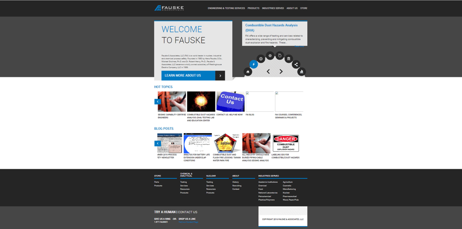
The whole process started with creative sessions comprised of collaborative inspiration and strategy. We believe in designing websites in which the results tell a compelling story. Through wireframes and unique design ideas, we were able to create a new homepage that combined FAI's wants and needs with our professional expertise. What resulted was a lead generation machine. The new homepage incorporated a more modern design with conversion opportunities splashed throughout.
When building the new homepage in HubSpot, our focus was on providing a stellar user experience that rendered consistently across all browsers and devices. To modernize the design, we included parallax scrolling and bold imagery. By implementing HubSpot CTAs we were able to track the effectiveness of our conversion optimization efforts.
Here is the Fauske & Associates, LLC current homepage:
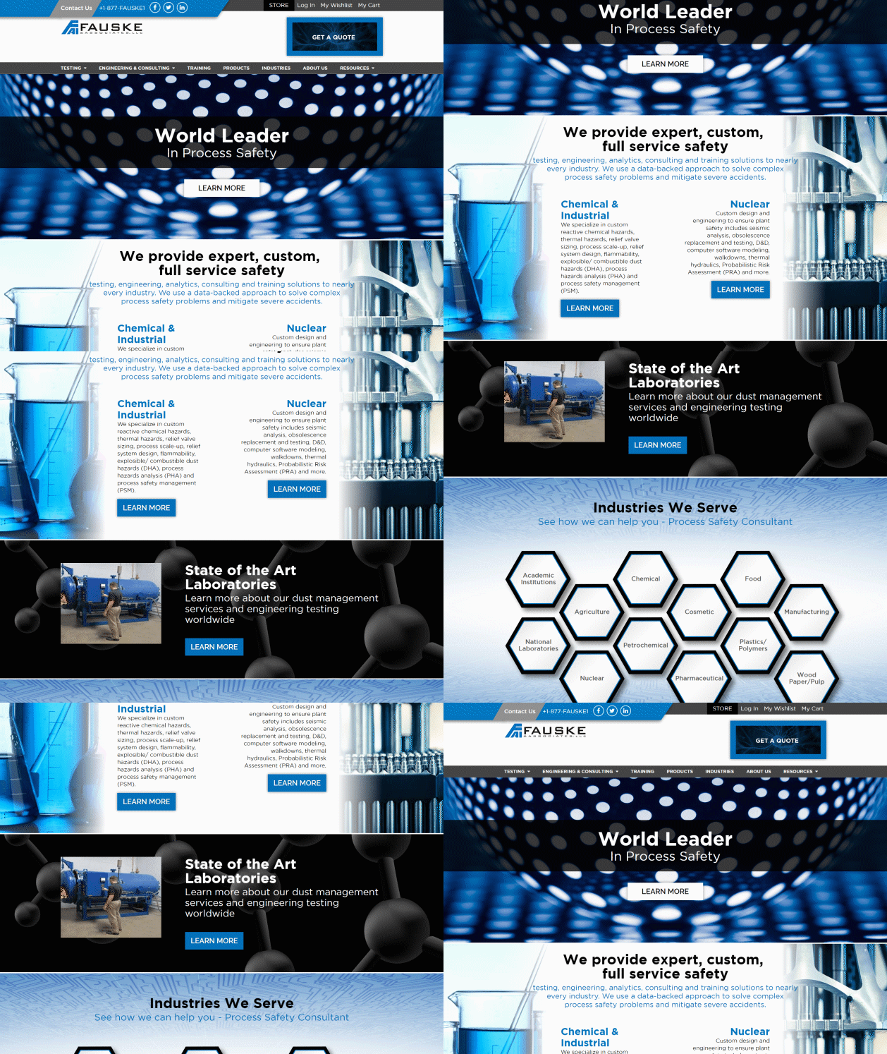
As mentioned earlier, one of the key concerns that we needed to address was the lack of conversion points on the FAI homepage. We implemented numerous opportunities for visitors to "learn more" about what FAI has to offer in the way of what they do and for what industries. They now have easy access to sign up for FAI's newsletters, download content offers, and request a quote. We were able to take FAI's existing content and other materials and repurpose them in a well thought out manner. We creatively designed options based on their personas and customer-driven experiences.
There is more to this website success story than what you can actually see. There is also behind the scenes work that we are tackling through our SEO efforts. We are working tirelessly to optimize the FAI website for improved search results, devising keyword strategies, fixing errors, building links, and creating directory profiles.
Our website is already garnering great results and it's only been a couple of months. We're still evolving!

The Fauske & Associates, LLC new homepage has been live since May 10, 2017. Yes, that's not a long time, but we are already seeing measurable results in just a few short months. Some key success metrics to note from the new homepage design include:
Let's take a deeper look at some of these numbers below.
As you can see from the images below (Fig. 1), the year leading up to our homepage redesign, the average time users were spending on the homepage was 2 minutes, 34 seconds. After we took the new homepage live, the average time users spent on the homepage jumped to 3 minutes and 47 seconds!
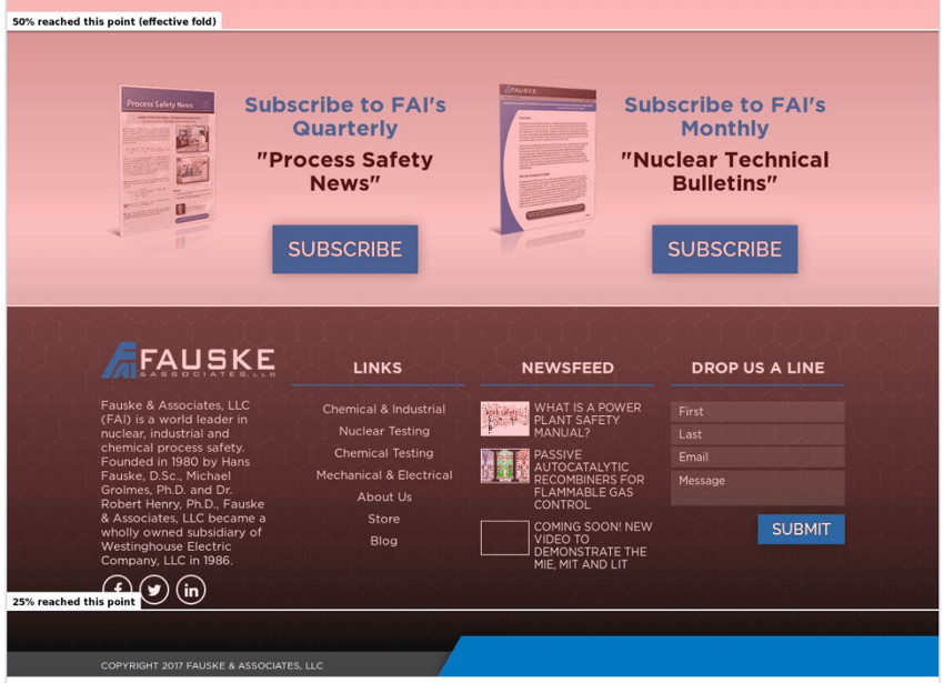
In addition, using data and heat maps from Lucky Orange, we are able to analyze how visitors are using and interacting with the new homepage design. We can clearly see from the heat map below (Fig. 2), the majority of users are consuming almost the entire homepage. On average, most users will leave a homepage about 50% of the way down. The new FAI website has 50% of the audience reaching the footer. At a time when seconds count and attention spans are at all at
Fig. 1 Time On Page Analytics
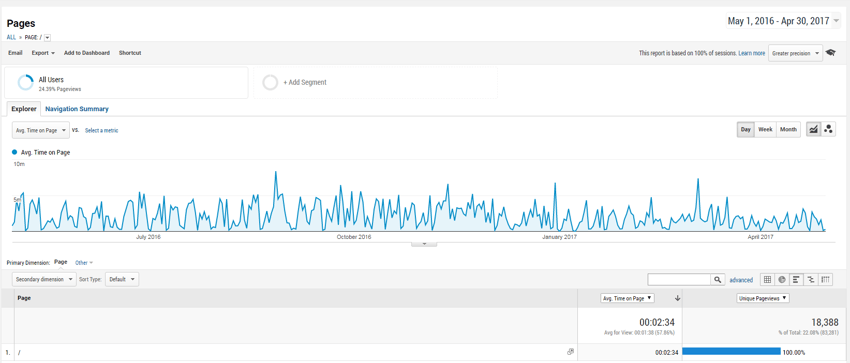
Before the homepage redesign.
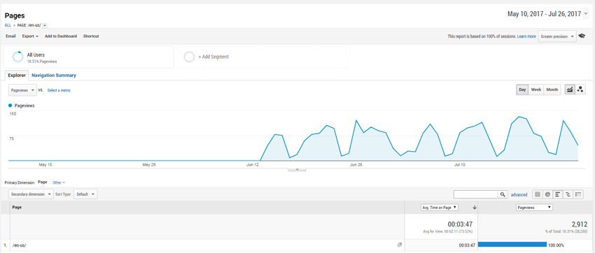
After the homepage redesign
Fig. 2 Heatmap of Scrolls
By far, the most successful conversion point was the "get a quote" button that we added to the top navigation bar. This allows sales qualified leads to submit direct quotes for testing or other services that they need. As you can see from the image below, in just 8 weeks we have a submission rate of 46%. Out of all of these submissions, about 90% are from new contacts, meaning they have not taken any other actions on the website in which FAI would have collected their information.

Through our initial conversations and research
The fresh design of the homepage for Fauske & Associates, LLC is attractive and is providing visitors with useful information that they are spending quality time consuming, as proven by the high time on page average and the number of users scrolling to the bottom of the page. Considering that we only have about 15 seconds to capture a reader's attention, I'd say the new homepage is doing a pretty darn good job.

Here at Revenue River Marketing, we use a process called Growth Driven Website Design which allows us to minimize costs, continually improve with real-time analytics, and see results faster. This is exactly what we are implementing with the Fauske & Associates, LLC website and making continual improvements. We analyze the top performing website pages, identify successes and problem areas, and devise a plan for improvement. We are implementing these meaningful changes, piece by piece. Since the website redesign, we have also redesigned the blog page and are in the process of developing a Resources page for FAI. Upon completion, we will move on to additional website pages that we've identified as areas in which we believe updates can make a big impact
Your website is meant to represent your brand virtually. It should match how you want to be perceived and capture the interest of your visitor. We did just that with the redesign of the Fauske & Associates, LLC website. The increase in time on page, the positive data on user consumption, and an increase in qualified sales-ready leads proves that our web strategy is working for FAI. We have helped turn the Fauske & Associates, LLC website into something that is exciting for their customers, their team, and their partners.
Are you looking to improve your website? Whether you are building a site from scratch, in need of a redesign, or looking to improve your site's performance, we can help. Reach out to us here at Revenue River Marketing or fill out the form below. We love solving for our customers!
